
If you have a website, or thinking of buying a website then you have probably heard of the responsiveness feature. If you have taken actions to ensure this applies to your website, or a website you intend to have built in the future then defiantly consider this feature as it can make or break your online presence.
Does my website need to be responsive? YOUR website has to be responsive as Google reports more than 70% of its traffic comes from mobile devices. First impressions are important and if your website does not respond to other devices such as mobiles then design will be misaligned which will give a bad impression to visitors.
In this article, I will discuss in more detail about the importance of responsive websites.
1. What is Responsiveness Website Design?
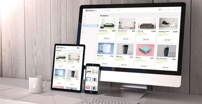
Responsive web design (RWD) is the process of your website to change its appearance to suit the device the visitor is previewing. For example, if a visitor is previewing your website from a mobile then it will appear different to say if the same visitor was previewing your website through desktop or tablet.
More important responsive website design is not limited to each device but rather it is optimized to change/adjust itself in accordance to the screen size that visitor is previewing. In other words, a website built with responsive capabilities will look good, work just as well across all devices, and screen sizes.
2. Why is Responsive Website Design Important?
Many people would dismiss this feature as trivial and having little impact on their business as a whole. Nevertheless, you could not be more wrong, research shows us just how detrimental responsiveness is to first impressions and ease of use.
Good first Impressions
If you have a website then you want to give a good first impression. Or more so, not give a bad impressions. If your website does not respond to mobile devices well then it will not look visually appealing. A visitor will instantly see this and before they have even browsed across any of you, content they will already have this negative connotation set in their mind. We already know this can be ‘make or break’ for job interviews and the same distinction is made for websites.
Actually, statistics shows that that 38% of visitors will stop engaging with your website if the content is laid out poorly. As ecommerce owner will know engagement is so important when trying to sell online.
Ease of Use
Furthermore, statistics have shown that nearly 60% of searches online are from mobile devices. With responsive websites, viewers no longer have to pan or zoom web pages in order to see and read the contents clearly.
Imagine if you are on a website and you cannot find what you are looking for because of a bad layout. You will get frustrated and leave. Actually, the data shows us that 88% of customers will not return if they have a bad experience on a website.
3. Responsive website Design can save your Business Time & Money
Responsiveness is not only required for your website but also for your business as it will save you tones of money and time in the long run. Before responsive website design a business would have to create a website for each device. This could include a minimum of three websites.
This makes managing a website harder, as three platforms will always need updating when 1 piece of content is changed. It is also more expensive as the cost of a website has just tripled.
4. Search Engine Optimization (SEO)
Search engine optimization (SEO) is the process of optimizing your website so it appears more frequently in search engines such as Google. Responsive website design is important for the SEO, as Google have established standards to the types of website they will show in their search results. This is because a responsive website provides a better use experience.
Google has remained the top dog search engine because it prioritizes the visitor positive experience above everything else. They are aware that this results in repeat visitors. In addition, they have built responsive website design into their algorithm for which website are prioritized in the rankings.
You can see if your website is mobile friendly according to Google here…
5. Increase Traffic from Mobile Viewers
In terms of SEO Google, will priorities the mobile friendly version in their search results page. AS they state “Mobile-first indexing means Google predominantly uses the mobile version of the content for indexing and ranking.”
I have personally seen the different in traffic across devices and a websites that is not responsive to mobile will get fewer visitors compared to desktop.
6. Mobile Responsiveness Increases Revenue
The final and most important point is that mobile responsiveness increases revenue in your business.
According to eMarketing’s survey, 59% of US retailers have declared that implementing a mobile-responsive design for their websites is a high priority this year. Further down the list of retailer priorities is creating apps for iOS devices at 28% and for Android at 22%.
Retailers understand this is important, as the data is overwhelming. For example, O’Neil clothing studied responsive website design and its effect on conversion rate, transactions, and revenue for solid three-week period. They found that transactions topped 333.33% (revenue increase of 591.42%) on mobile Android devices and 112.50% (revenue increase of 101.25%) on mobile Apple devices when responsive website design was implemented.
Conclusion
A website needs to look good on all devices and screen sizes. Responsiveness in web design promises engagement from mobile viewers, can help you save costs and time.
Managing a business is never an easy work, so let technology help you with some of that, lighten the load on your shoulder through the aid in management. However, operating three websites at the same time can be costly and ineffective. A website requires regular maintenance and management in order to function. As a result, building an entirely new website to accommodate the layout of another device is very unpractical. Instead of building another website for mobile devices, responsive design can fit the contents into the screen sizes of the mobile devices. This way, you can serve viewers on both platforms using one website, and save the cost of running another website at the same time.

